The problem
When an employee files a health insurance claim, their HR team usually hears about it from the employee, often more than once. To answer, HR had to email or call their relationship manager, who looked it up and wrote back.
The dashboard did have a claims section, but it was slow to load and left out cashless claims, so HRs didn't trust it and asked anyway.
How it got here
The HR page reuses the definitions from an earlier claims dashboard for our own team, so both sides count a claim the same way.
- JulClaims analytics for our teamBuilt first for relationship managers, with the claim definitions the HR page later reused
- SepPRD and first buildWritten up with what was ruled out, then built and redesigned on real data
- 8 OctOpen to every HRA Claims tab in HR analytics for every client
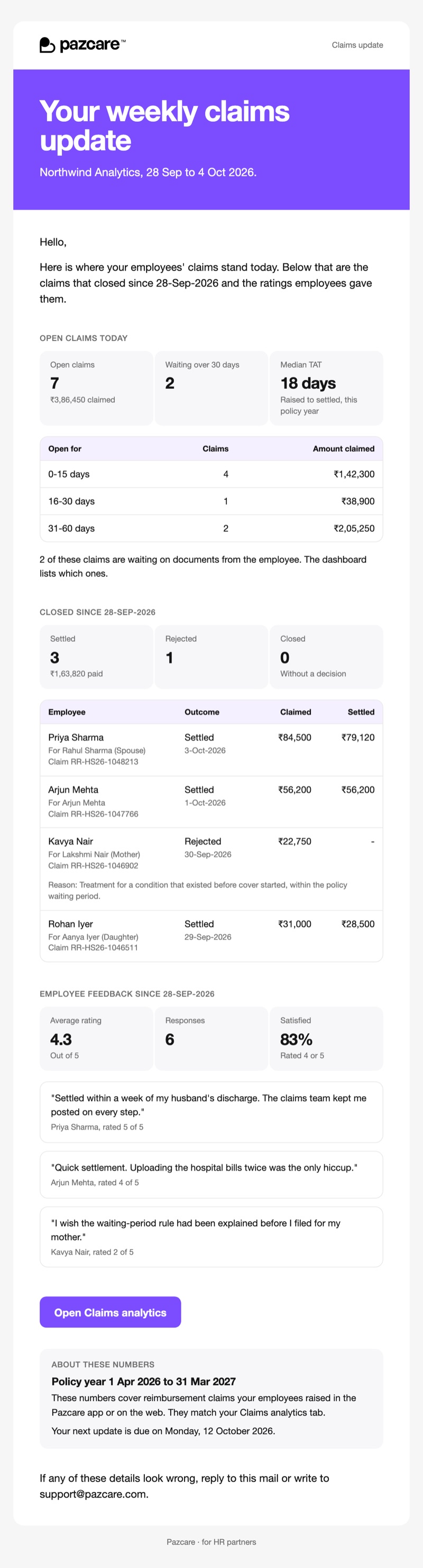
- 10 OctDigest for every clientWeekly or monthly, for HRs who don't log in
How it works
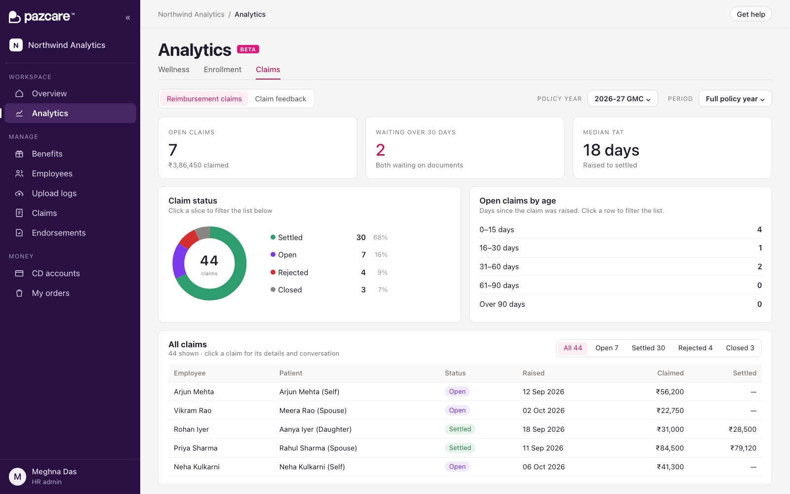
The page shows one company and one policy year: a few numbers at the top, charts by city, relation and month, and the list of claims. Opening a claim shows its timeline and the support conversation about it.
- Every number leads to its claims. One set of filters drives the numbers, the charts and the list, so clicking "47 waiting" shows those 47 claims and what each one is waiting on.
- Statuses in HR's words. Internal statuses are mapped to plain ones. Three kinds of "documents pending" become "More documents needed", and claims we haven't filed yet read "Yet to reach insurer".
- How long claims have been open. Open claims are grouped by age: 0–15, 16–30, 31–60, 61–90 and 90+ days, so the slow ones stand out.
- Small companies get a list, not charts. Below 25 claims, charts say more about chance than about the company, so they're hidden.
- The digest picks its own pace. A company with 20 or more claims in the last four weeks gets it weekly, the rest monthly. It goes out on Monday afternoons.
Decisions
The old section looked up each claim through about fifteen nested queries and dropped cashless claims. Patching it would have kept both problems, so the new tab reads from one place built for it.
HR thinks in policy years, because that's when cover renews. Grouping by the date a claim was filed put 69 of 118 claims in the prototype under the wrong year.
A pilot list would have meant choosing which HRs keep emailing for updates. Turning it on for all clients, with a way to switch it off for one, got it to everyone at once.
Who did what
Me
The PRD, the design and the redesign of the page once it ran on real data, and the digest email.
The team
An engineer built the tab and its backend. Relationship managers tested it with their clients.
Result
Every client HR can see where any claim stands without waiting on a reply, and the ones who don't log in get the same picture by email.